question archive The following table shows the number of employees in Ontario and Quebec in the health care and social assistance fields from 2010 to 2014
The following table shows the number of employees in Ontario and Quebec in the health care and social assistance fields from 2010 to 2014
Subject:StatisticsPrice:4.87 Bought7
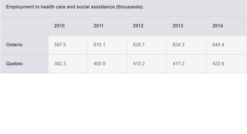
The following table shows the number of employees in Ontario and Quebec in the health care and social assistance fields from 2010 to 2014.
Create time-series graphs to display both sets of data.
Which province appears to have the largest growth in this employment field? Justify your choice.
Calculate the percentage change for each province from year to year and graph these new data.
Do the percentage change graphs tell the same story as the graph of the population figures? Explain.

Purchase A New Answer
Custom new solution created by our subject matter experts
GET A QUOTE
Answer Preview
Answer:
a.
b
It is Ontario because as we can see that in absoulte terms Ontario is employing more number of people. Also if compared from year on year in percentage terms, Ontario is better than Quebec.
c
| Year | Quebec | Ontario | Quebec_% Chg | Ontario_% Chg |
| 2010 | 392.3 | 597.5 | ||
| 2011 | 400.9 | 615.1 | 2.19% | 2.95% |
| 2012 | 410.2 | 628.7 | 2.32% | 2.21% |
| 2013 | 417.2 | 634.3 | 1.71% | 0.89% |
| 2014 | 422.6 | 644.4 | 1.29% | 1.59% |
|
|
d
The percentage change charts do not tell the same story because in terms of percentage change, Quebec is leading in two years and Ontario in another two.
PFA